
| User guide |   |

In the previous section we noted that when using layouts you never need to set the position or size of a user-interface component yourself - the layouts take care of it. So how do you control the sizes of the components?
Each layout that arranges multiple items within its drawing area
has a sizing property: for horizontal and vertical boxes this
is called Sizes; for grids we have RowSizes
and ColumnSizes. These all obey the same convention:
By default all sizes are set to -1 (variable size with unit weighting).
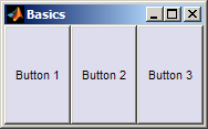
Let's take a simple example:
f =figure(); layout =uiextras.HBox( 'Parent', f );uicontrol( 'String', 'Button 1', 'Parent', layout );uicontrol( 'String', 'Button 2', 'Parent', layout );uicontrol( 'String', 'Button 3', 'Parent', layout );

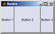
We can set the middle element to be twice as wide as the others (but still variable width) by setting its weight to -2 with the others at -1:
layout.Sizes = [-1 -2 -1]

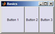
Alternatively we might want the first element to have a fixed width of 100 pixels with the others filling any remaining space equally:
layout.Sizes = [100 -1 -1]

This ability to mix fixed and variable sized elements is crucial in interface design. It really comes into its own when building a heirarchy of layouts, described next.

Many of the multi-element layouts also provide a MinimumSizes
property to prevent an element becoming too small. This is measured in
pixels and defaults to one pixel. If the specified minimum sizes cannot fit
within the available space then all element sizes are reduced to fit.
 |
Types of layout | [Top] | Layout heirarchies |  |